


Beto Just Won the Logo Wars
Beto and Inslee: A tale of two designs.

Beto O’Rourke has already won the 2020 graphic design championship.
When he jumped into the race last week, Beto debuted a campaign logo that’s an instant classic and a lesson to aspiring candidates everywhere: Your logo is your brand. It should be durable and robust enough to be ported from one campaign to another. If you have to redesign it every election, then you’re not doing it right.
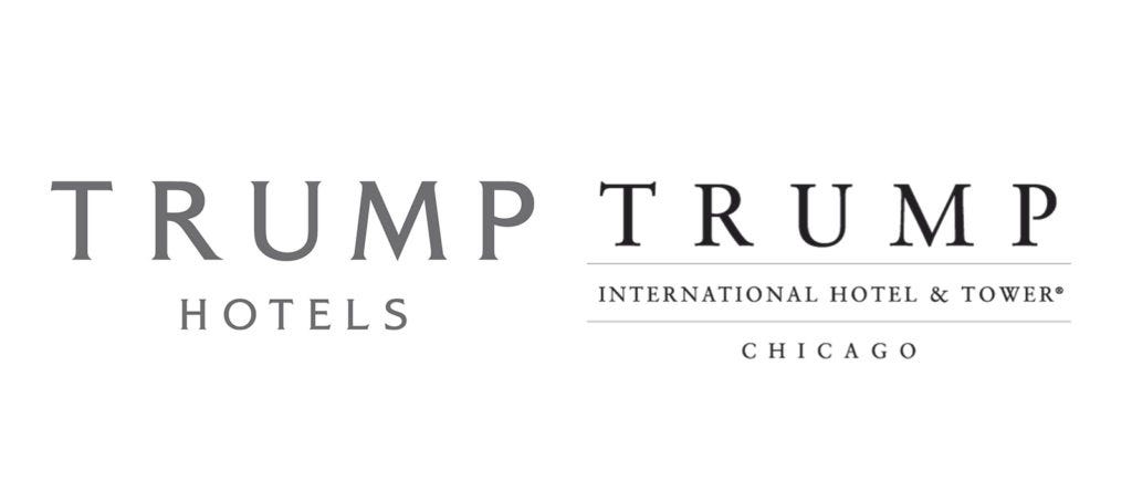
Take Donald Trump. Look at his various pre-presidential logos:
Now look at his campaign logo:
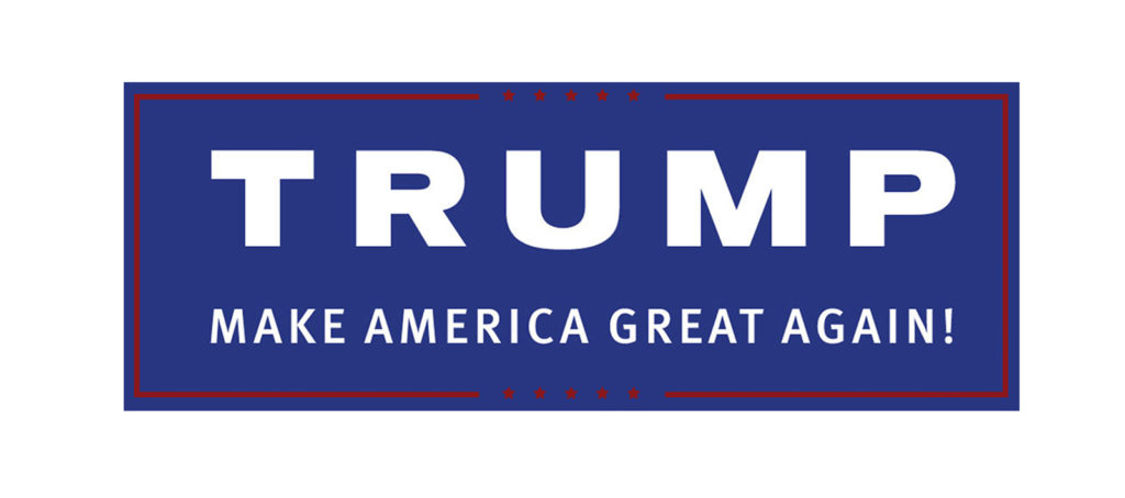
There are important differences: The font choice, the color scheme. But the overall design theory is the same: Trump, in ALL CAPS, with heavy kerning between the letters, bigger than the other words, which lie below it.
That’s a consistent brand.
Now here’s Beto’s logo from his 2018 failed Senate bid next to his presidential logo:

Total consistency for the product mark.
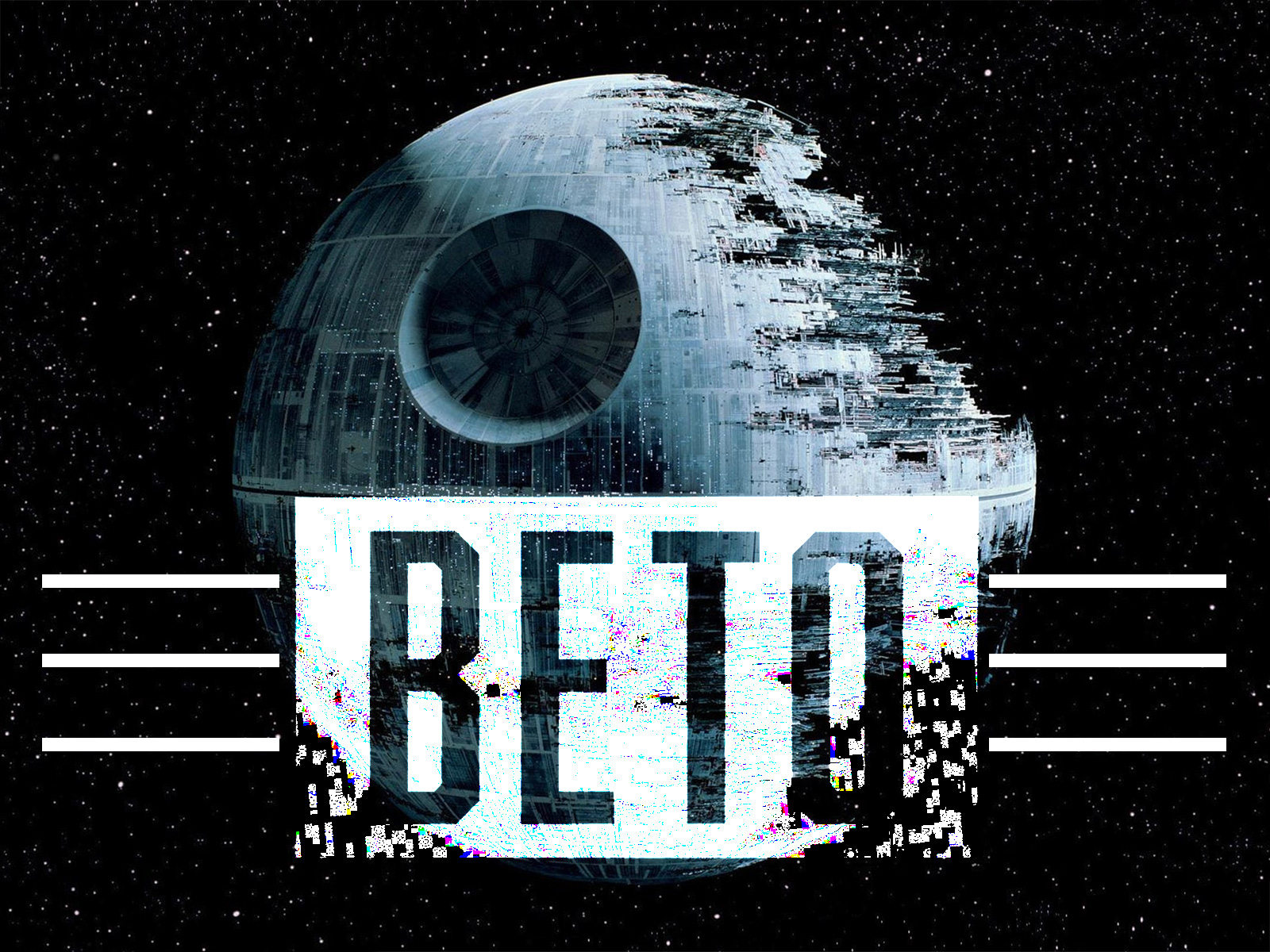
And the mark itself is incredibly striking. Designer Tony Casas took the candidate’s uncommon nickname, rendered it in a strong, ALL CAPS Abolition font. This gave him roughly a 16:9 ratio block to play with, so he stuck the whole thing inside a rectangle. And then he did something radical: Stark black and white.
The idea behind the color choice was to place Beto out beyond the traditional political spectrum. As Casas explained, “Beto rides center on most issues and I really wanted to focus on a bipartisan design that didn’t lead voters to look left or right.”
The result is a logo which puts complete and total emphasis on the candidate and is simple enough to function as an immediately identifiable mark. The only other element is the twin sets of Whataburger triple rules. And the uniqueness of the font and the colors make it flexible enough so that anything using Abolition in black and white is immediately recognizable as part of the Beto brand:
It’s important to note here how design doesn’t exist in a vacuum. This is a case where the design really only works because of the candidate. Beto is selling a young, energetic, post-partisan campaign. He’s pitching himself as the guy bringing everyone together by running beyond politics. The design speaks to exactly this proposition.
It’s a home run.
And then there’s Jay Inslee.
He’s the governor of Washington State who’s running for chancellor of the biodome:

I kid! (Sort of.)
Inslee’s entire campaign is about climate change. He’s a single-issue candidate. And his logo reflects that, by making the half circle of blobby green and blue the focal point, with his last name in ALL CAPS. Beneath “Inslee” is a thick red rule. And then, right-justified in ALL CAPS is “Our Moment.”
Note the period. I bet the design team had hour after hour of meetings deciding on whether or not to use the period.
I have questions.
Not so much about the biodome graphical element. It’s poorly executed here—too fuzzy and indistinct, the colors mottled and muted. But I like the idea! Some people run “for president.” Some people run “for America.” Kamala Harris is running “for the People.” Inslee is running “for the planet.” Literally. Why not own it?
But that font . . .
It’s not quite a serif so much as a tail that’s only pointing on the left leading edges of vertical lines. It’s quasi-futuristic—definitely in the space family—but to be honest, I kind of wish he’d eaten the whole wheel of cheese.
What really bothers me, though, is the sans-serif italics he then uses for “Our Moment.”
The tails on “Inslee” are pulling your eye to the left. But the exaggerated lean on the “Our Moment.” pushes your eye to the right—as does the slanted ends of the red rule. (Why are they slanted as opposed to straight? Who in God's name is in charge here?) Our eyes are being pointed in two different directions. There’s that weirdly emphatic period. There’s a giant, Level-5 planet looming over us. It’s all very disconcerting.
Honestly, if Jay Inslee wanted my vote, all he would have had to do was this:


