


Mayor Pete and the Amazing Technicolor Dream Logo

Have you heard the news? Mayor Pete is the new hotness!
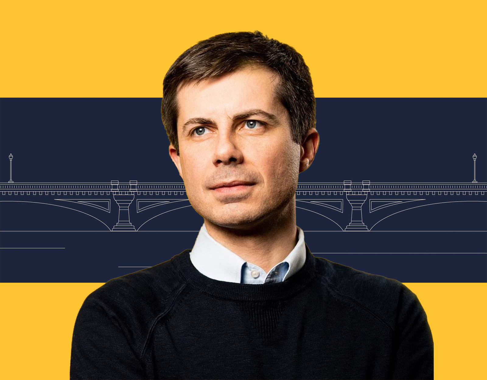
Over the weekend, South Bend Mayor Pete Boot Edge Edge held his official campaign kickoff, timed to go along with a cover-story profile in New York Magazine, and the launch of a massive graphic design operation centered around the reveal of his logo.
So much to talk about.
First, let’s start with the fact that Mayor Pete didn’t just launch one logo. He launched six (6!) official logos. That’s almost one logo for every foreign language in which the gay Harvard Rhodes scholar is fluent!
Let’s have a look:

There’s a lot to like here.
We have a central design—"Pete" inside an abstracted bridge.
That design has been pre-adapted to three different formats: landscape, circle, and square.
The designer has an entire color palette for the brand, relying on soft and earthy colors: Primarily blues with a yellow, an orange, and tan/brown/gold.
And every one of these colors has a reason for being.
The design team has even gone to the trouble of coming up with individual campaign logos for each state, using the base logo and custom fonts that do a truly beautiful job of capturing the the states' old-timey spirit. Just have a look:

All in all, this is an A effort.
Mayor Pete’s designers start from a difficult position. They’ve got an entirely new brand that no one in America had heard of until 12 weeks ago.
This new brand is essentially a blank slate, with no recognizable achievements behind it.
This new brand has a surname that is ugly to look at, hard to spell, and basically unpronounceable: Buttigieg.
So what did they do? They focused on the first name, which was the obvious play. And they infused the base logo with a symbol that plays on the lack of achievements. The bridge tells viewers that this candidate isn’t about where we are now, but about getting through to someplace new.
As an added bonus, this symbol has a built-in resonance to older viewers who, if they remember anything about the 1992 campaign, remember that Bill Clinton was going to build “a bridge to the 21st century.” And pretty much everyone has fond memories of Bill Clinton these days.
Is it a little strange to have a 37-year-old appropriating the graphical language of the departed Industrial Age? Sure. But it’s also reassuring. It’s exactly the opposite of Beto, whose logo is a bold call for a generational-change mass movement. Mayor Pete isn’t as radical and isn’t trying for rock-star personality cult status. His logo says: “It’s not about me. It’s about getting to our future.”
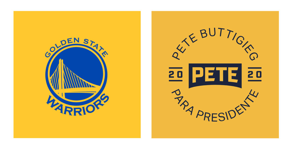
If I have one real criticism, it’s about how the circular version has weird echoes of the Golden State Warriors logo:
But to tell the truth, the product I’m most impressed with here is this:
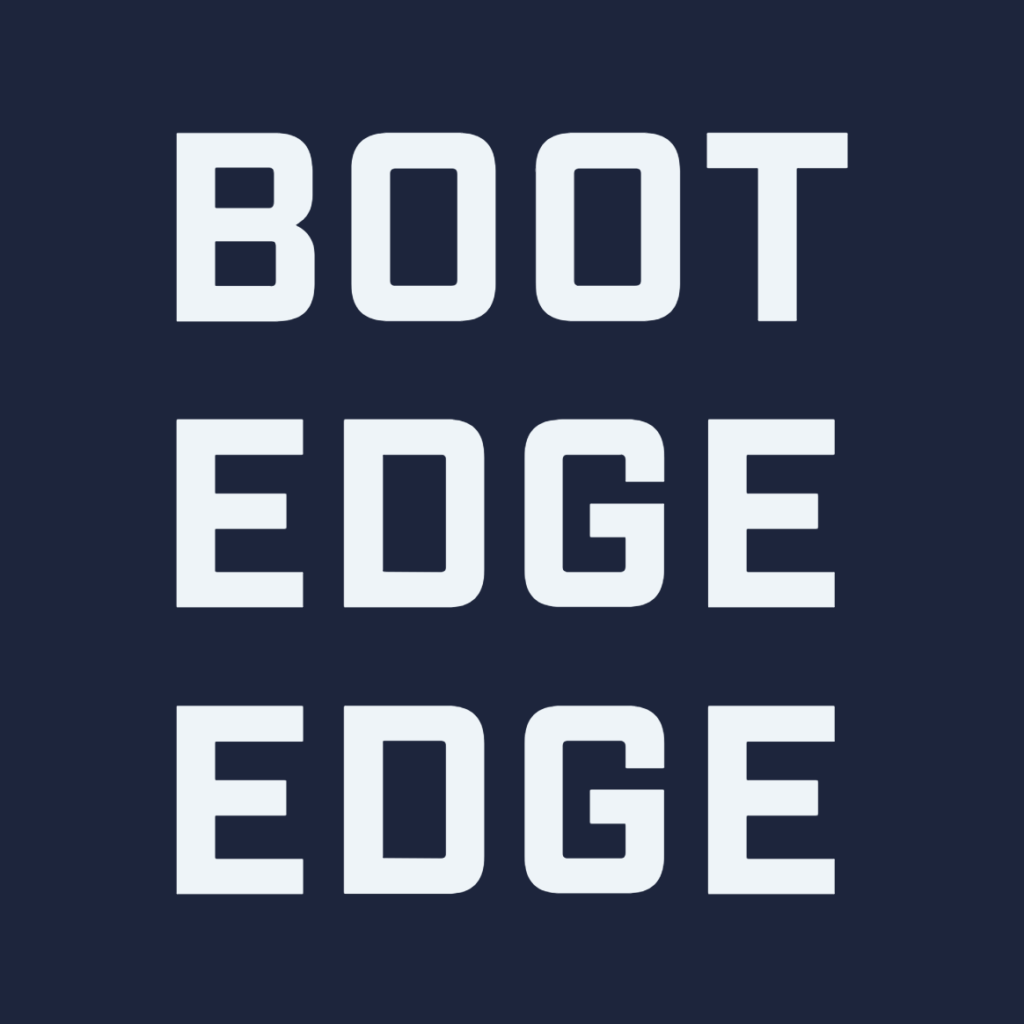
This design achieves a number of goals, all at once:
It’s an instantly recognizable square wordmark.
It defines the candidate’s name in an understandable way.
It creates an instant rally cry for audiences. You can just hear them chanting “Boot. Edge. Edge. Boot. Edge. Edge.”
What’s really interesting here is that the graphic design is altering reality. My understanding has always been that “Buttigieg” is pronounced “Boot-a-judge.”
But that’s still hard to remember and graphically, you can’t do anything with it.
This graphic imprints an easy-to-remember phonetic pronunciation inside a graphical memetic that will look great on T-shirts, stickers, and ball caps.
That’s a lot of work for one mark. Kudos to the design team for coming up with it and solving a major problem for the brand.
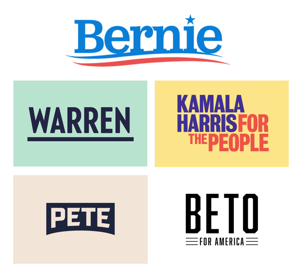
It’s funny that the most radically different Democrat in the field—Bernie Sanders—is using the most conventional iconography. His logo could have been used in any presidential campaign of the last 40 years.
Just take a look at his logo compared with what the other top-tier candidates are doing.
In a way, this may be by design. Bernie’s challenge isn’t to convince voters how much he’ll change things. He needs to reassure them that he won’t change things too much. That he's not going to turn America into the Soviet Union. If Bernie had some sort of avant-garde, AOC-style logo, it might look super cool. It would also be . . . not helpful to his brand mission.
That said, I think that Bernie’s traditional logo points toward his biggest vulnerability in the primaries: He’s old and America may be just about done with the Baby Boomers.
Bernie Sanders is in an incredibly strong position. He should be close to an even-money favorite to win the nomination.
And Democratic voters want change.
If Sanders is going to be beaten, it will be because someone figures out how to make the change argument in such a way that Democrats decide that the shift they want to make isn’t ideological, but generational.


