


Joe Biden's High Crimes Against Logo Design
Biden is running for president. His campaign logo is an affront to man and nature.

Joe Biden is finally running for president and along with his carefully understated launch video he rolled out a website and not one but two logos.

Let’s start with the less terrible one.
I know, I know—which one am I even talking about, right?
There’s nothing especially objectionable with the rectangular “Biden” logo. The color scheme is decidedly old-school red, white, and blue, with the only modern aspect being the super-sans serif font. The red-striped flag element in place of the “E” is derivative and unhelpful, but maybe not too much of a net negative. (I would have preferred a comp with “Biden” all in straight text.)
The best thing this design has going for it is “President.” Everyone else in the Democratic field is running for America or the People or the BioDome. But Biden’s entire campaign is really about his status as front-runner—as the guy who will beat Trump. The choice to put “President” there emphasizes this idea. It gets you halfway home. It makes you realize that maybe, if you squint, you could see some of the other candidates as president of these United States, but that Biden is a natural fit. He’s ready for the job.
So maybe it’s not a home run. Maybe it’s not going to win any awards. But primum non nocere, right?
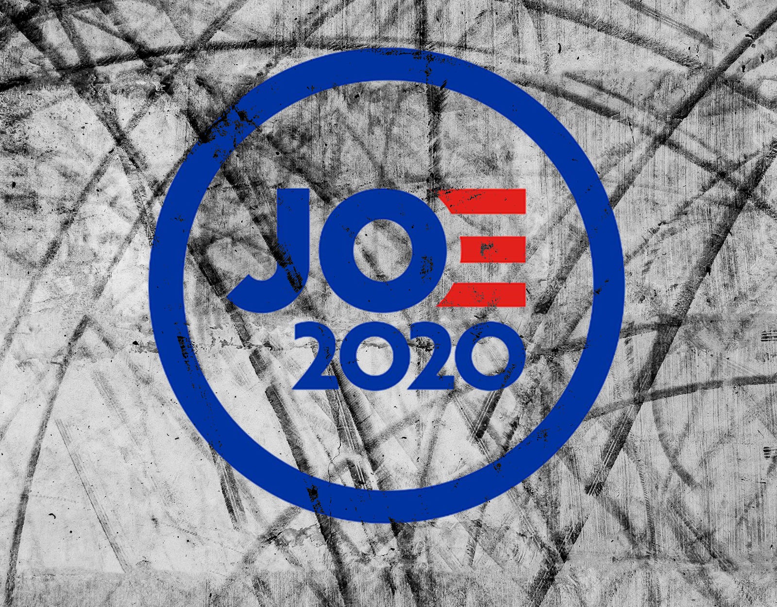
Which brings us to the circular “Joe” logo.
It is very not good.
People are fixating on the idea that this is a thematic rip off the iconic Obama 2008 logo. But that’s not really what’s going on here. If only that was the case.
If anything, Biden rejected the opportunity to directly rip off the Obama “O” by going with stylized “E” and deliberately ignoring the central “O” of his own name. This obvious connection would have made for a more symmetrical design. By not capitalizing on that, the only similarity, really, between Obama 2008 and Biden 2020 is the presence of an outer circle. Everything else—the use of that circle, the color scheme, the design idea—is different. And terrible.
If you believe Biden’s launch video, he decided to run for president in August of 2017. This logo looks like it was thrown together last night.
Leave aside the red-striped “E” (which is an off-the-shelf element) and the color palette (which might as well be called “American Politics, Generic”) and just look at the positioning of the circles in this trainwreck. We have four of them—the outer circle, the “O” in “Joe,” and then two zeroes in “2020.”
These circles should either be balanced or pointing in some sort of thematic direction. Or giving a sense of movement. Instead, they’re arranged haphazardly, like someone just threw darts at a board:
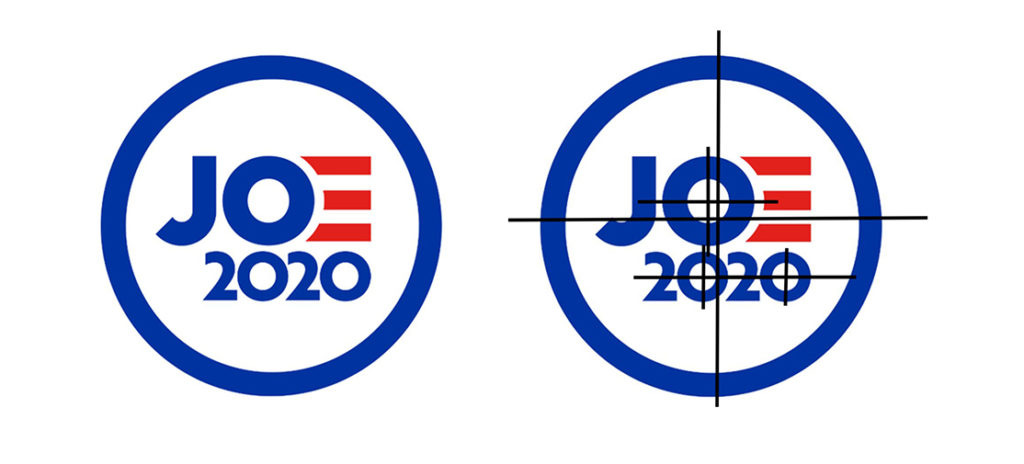
This scattershot arrangement is why your eye positively hates this logo.
There are other things not to like. The font design on the “2” is thoughtless and the angles created by the left side of the numeral fight with the line suggested by the loop of the “J.”
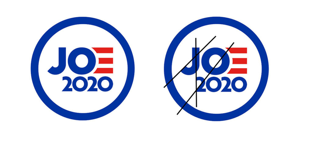
For the love of God, why aren’t these lines parallel?
The effect of this lackadaisical emblem, with its heavy-stroke border, is simultaneously evoking a crowded cattle brand or the logo for a local rural coffee shop trying desperately to be more hip than it is. This might be unfair to the cattle brands and the coffee shops.
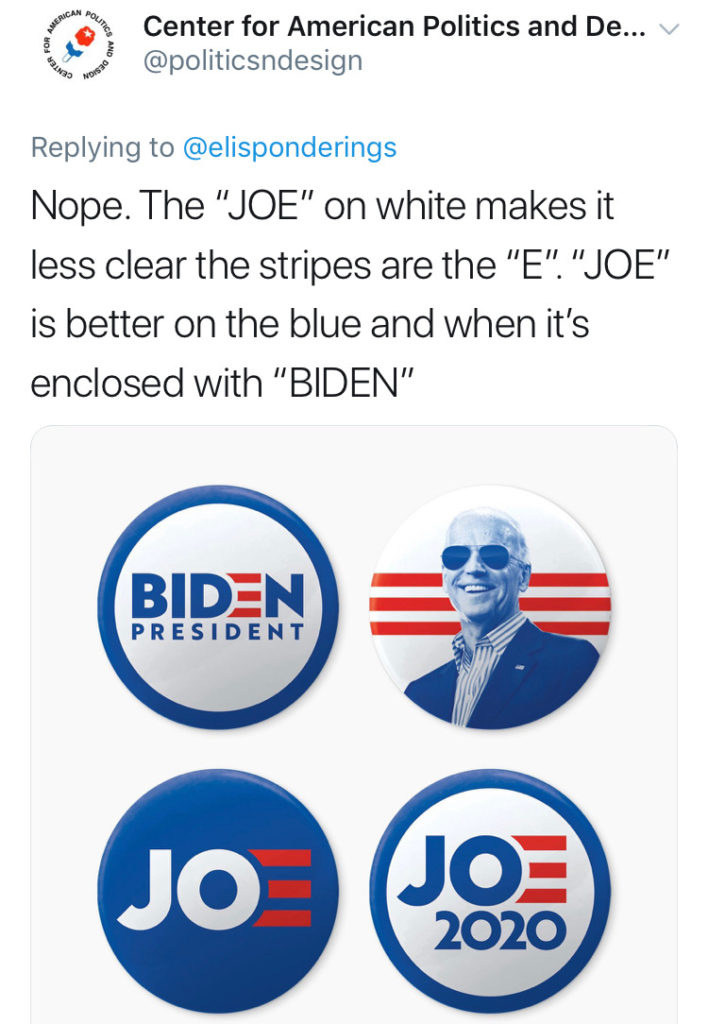
Then there is also the unfortunate Button Set available for purchase on his store revealing four iterations of the brand identity:
So many questions. “Am I the only one who thinks this logo makes it look like his name is Jo?” has been posed by multiple people on Twitter. The Center for American Politics and Design initially responded to this question with a defense of the logo using the buttons as a reference saying: “‘JOE’ is better on the blue and when it’s enclosed with ‘BIDEN.’” I’m sympathetic to how much less objectionable the logo concept is when you put the “Biden” logo inside the circle—or even just drop the “2020.” Suddenly the “O” in “Joe” is centered in the larger circle and you don’t feel angry and agitated when you stare at it. But I don't buy the reasoning that the colors play together in these iterations: the red stripes against the blue are muddy and indecipherable while in contrast, the white “JO” jumps off the dark background. They have since deleted the tweet.
Yet the aspect of the design that’s most maddening is that the product has so much built-in potential. Biden is well known enough that you could use either “Biden” or “Joe.” Both names lend themselves to attractive wordmarks. Because of his connection to Obama, you have license to piggyback on a universally-loved design.
And you start from a level of built-in openness from consumers because whether or not people want Joe Biden to be president, just about everyone in America likes him. The brand awareness is there. The goodwill is there.
The design team didn’t have to manufacture any of that. They just had to channel it.
Correction: An earlier version of this article incorrectly referred to the Obama 2008 logo as being from 2000.


