


How to Hack Politics with Design . . . and How Not To
A tale of two design concepts.

Hey everybody! Bill de Blasio is running for alderman! Or water commissioner. Or maybe the state legislature as an independent? I dunno. Have a look at this:
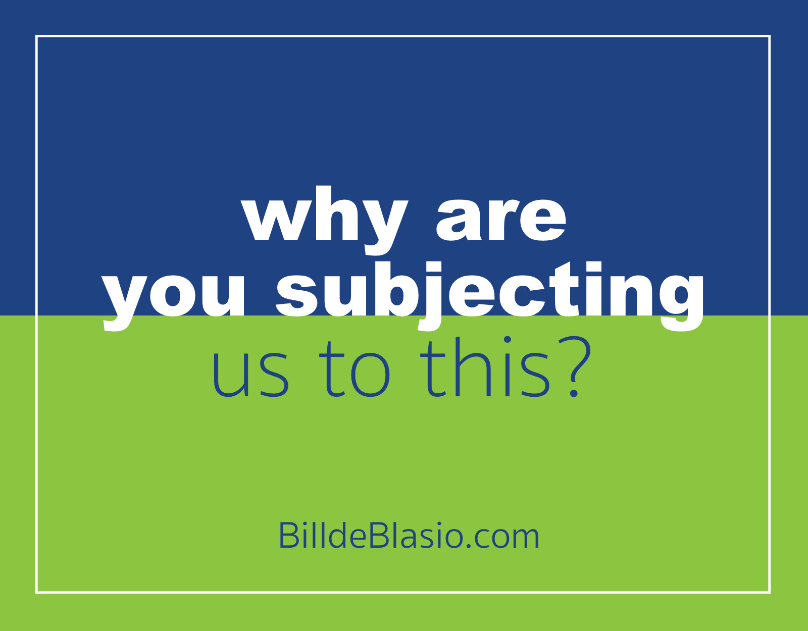
So you’ve got a guy with a lower net-approval rating than President Trump, an off-putting surname, and no viable path to the nomination or reason for running. And you decide that the way to make a splash is by putting a blue rectangle over a green rectangle using colors from MS Paint? And then plopping down “de Blasio” in a thick sans serif? And then adding, like an afterthought, a really thin “2020” beneath it?
Why even bother with the “2020”? Seriously. If you’re going to make it so hard to read, just kill it. Let “de Blasio” have the whole space to itself.
Here is the best that can be said for this design: At least they didn’t put “de blasio” all in lowercase. Although, to be honest, this is the one scenario in which lowercase might have been an improvement.
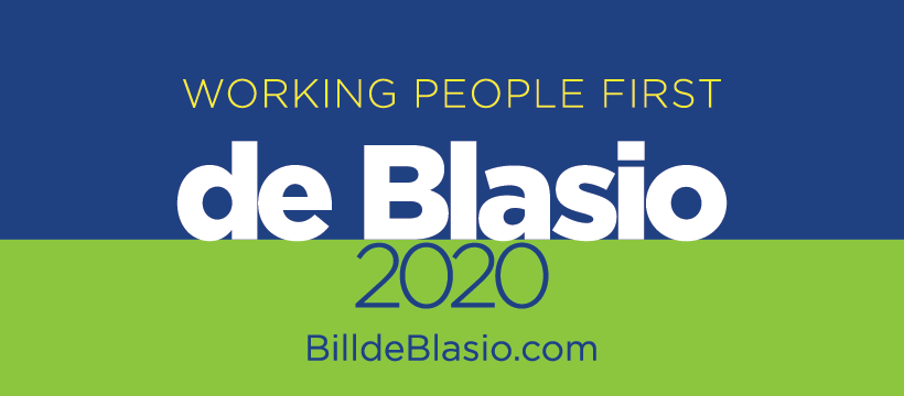
Bill de Blasio is the mayor of New York City which is the design capital of the world. He probably walks past 30 competent graphic designers every morning in the YMCA in Brooklyn where he works out. How could he have launched a presidential campaign with this? It looks like it was thrown together with one of those make-your-own-logo freebie websites.
You can have your own unique branding logo in under five minutes—just answer these simple questions!
The only thing worse than BdB’s logo is his website. Here’s what you see when you go to it on a desktop:
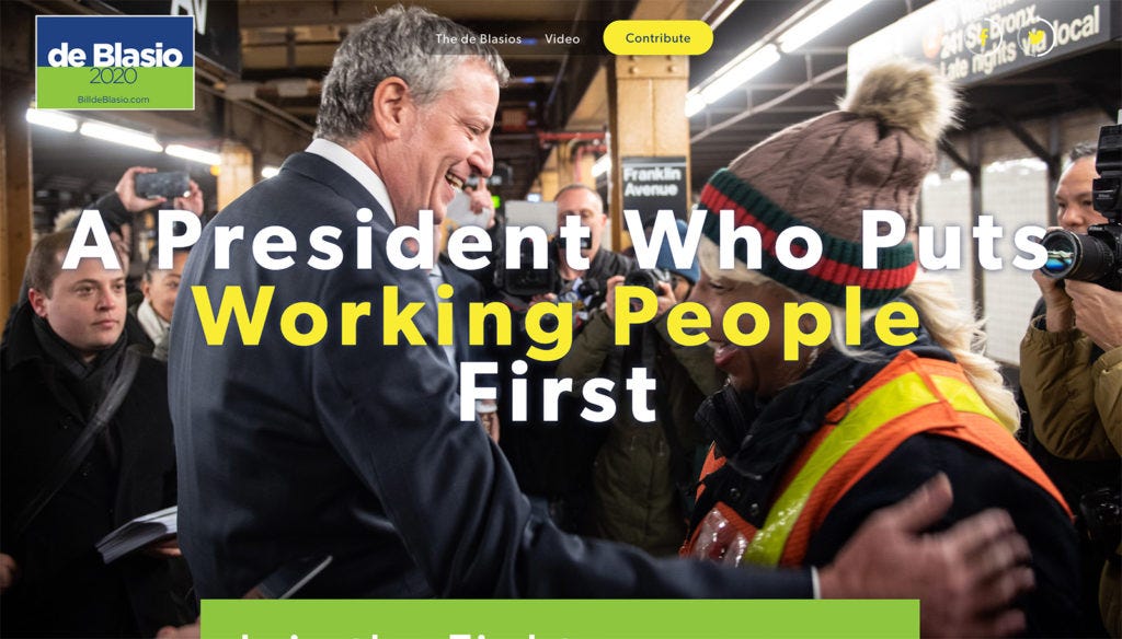
Quick: Find the Facebook and Twitter widgets that allow visitors to share their excitement about being on Team BdB.
Go ahead. I’ll wait.
You keep looking, but your eyes are hurting, aren’t they? You’re irritated, but you don’t know why. I’ll tell you why.
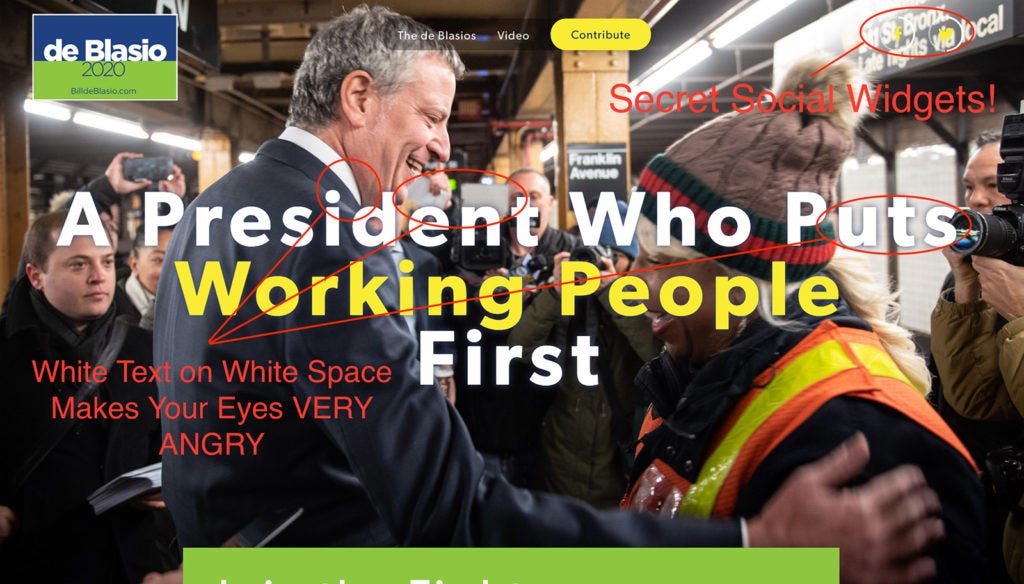
You can't read it. They’ve put lettering over a picture with lots of bright white in it and this makes your eyes angry. It makes your eyes even angrier when the text is also white. How angry? Like “HULK SMASH” levels of angry.
Fortunately, we have a counter example of truly great design work. Ladies and gentlemen, I present to you the Brexit Party:
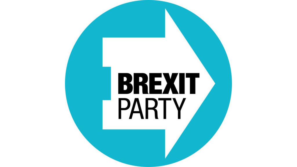
Brexit is a pretty radical idea, but this logo is totally calm. It’s got soft, welcoming baby blue. It’s defined by the curve of a circle. It incorporates a generic symbol of a house. Your home, even! And then it suggests forward progress by rotating the house so that it becomes an arrow pointing to the right.
It’s telling you that going Full Brexit is actually just moving forward to the home state you’ve always loved.
But that’s just the start. The real genius is that the Brexit Party designers have actually hacked the British political system.
The upcoming European elections in the UK will feature paper ballots. And the electoral authorities informed the various political parties that the logo of their party will appear on the ballot after the name of the candidate and before the box which voters would check.
Like this:
https://www.instagram.com/p/BxSvDdZBDuh/?utm_source=ig_web_copy_link
Have a look at how the Brexit Party mark functions compared with the logos of other parties in the wild:
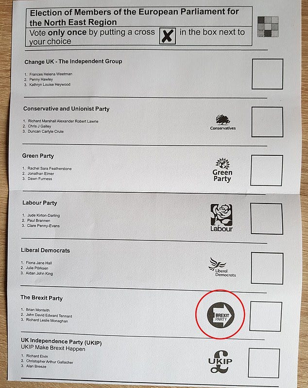
The advantage is obvious. On the ballot, the soft-blue is translated to black and that circle of black becomes the leading focal point of the page. The interior arrow then points clearly to the box that you’re supposed to check.
I can’t tell you how many low-information voters this subliminal instruction will move, but I would be willing to bet it's more than the number of Iowans who wind up caucusing for Bill de Blasio.


