

The Serif and the Fury
Grading Amy Klobuchar's campaign logo against the field.

Oh Amy. Amy, Amy, Amy, Amy.
She may just be a poor Minnesotan lawyer but she’s running for president and she’s got something no one else does: Serifs!
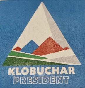
You may recall a couple weeks ago when the Mt. Klobuchar 2020 logo comp was “accidentally” discovered:
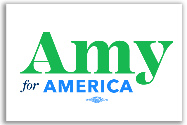
Well, now Sen. Klobuchar has officially jumped into the race. With this:
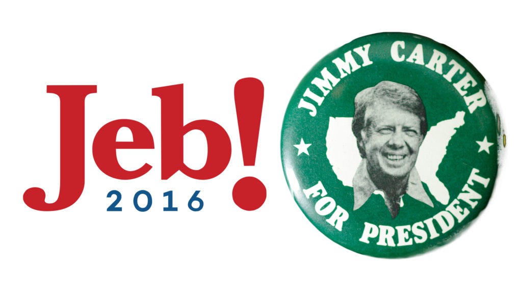
It’s like Jimmy Carter and Jeb! made sweet love and had a baby.
I kid. Because the Klobuchar logo is pretty okay.
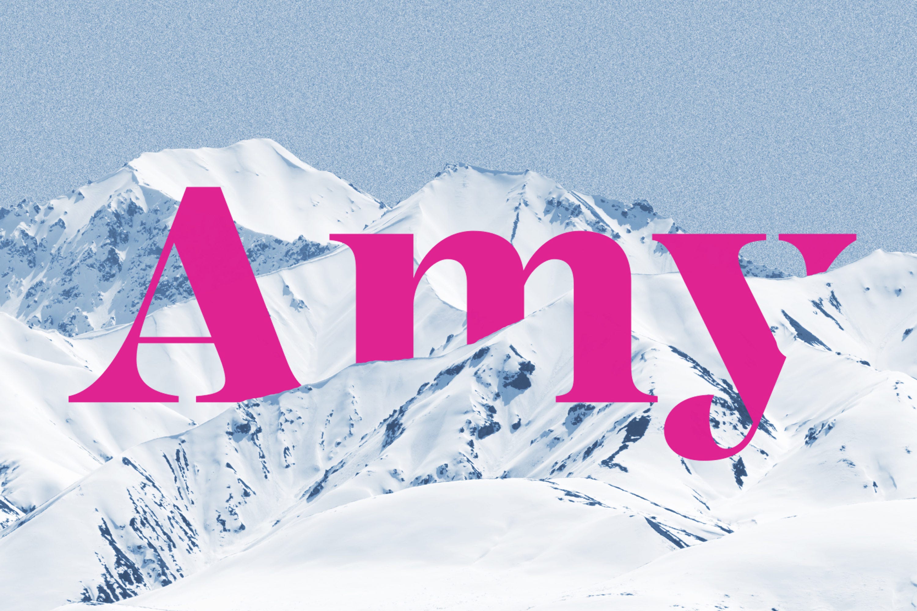
For starters, she basically had to use “Amy” and not “Klobuchar” because, well, just look at the typography of her surname. It’s not quite “Galifianakis” level trouble, but it isn’t awesome. She’s using bright, but soft, green and blues, which stand out without feeling cheap or glossy. The logo is tight and compact so that you can use it pretty much anywhere: in portrait, in landscape, in a square.
I don’t love how “America” is off-center—every time I look at the logo I want to reach into the screen and nudge it to the right. But the really polarizing aspect is going to be the fonts. Klobuchar’s logo uses three distinct fonts to get across a total of 13 characters. That’s . . . a lot.
We start off with a very serif-y “Amy” in what looks like a version of Century 725 Black, or ITC Modern No. 216 Heavy, but is probably a custom font. (Look at the highly-stylized tail on the “y”.) If you think this “Amy” stands out from the crowd, it does. Have a look at the other 2020 Democrats:

Now look back at “Amy.” She’s the only logo using a serif font and the only candidate with her name in title case (as opposed to all-caps). This is a subtle differentiator, but it’s real. When you see a yard full of candidate signs in Iowa, “Amy” is going to stand out because even if your brain doesn’t process the difference, it registers with your eye.
Furthermore, “Amy” manages to employ the serif font without the pitfalls of the Metropolitan Museum of Art and ZARA logos. These two brands went the serif route but did so in a condensed and claustrophobic way with the letters all running into each other or on top of each other. Both have the effect of being “static, like a stamp” whereas Klobuchar’s logo succeeds thanks to the sense of motion from the unique “y” and overall legibility—each of the letters has enough space to breathe.
Below “Amy” we get a small italicized “for” in another serif font. (It’s all lower-case, too. Something else we haven’t seen yet from any of the other candidates.) And then we get “America” in a very modern sans-serif that’s all-caps.
For a wordmark, this is pretty good stuff. Simple, memorable, different in subtle ways from competing products. Except for the off-center “America”—which actually bugs me more every time I look at it, especially because the “Union Made” shield is centered—this is nice design work.
And yet, it is just a wordmark. There’s nothing iconographic in it. There’s nothing about it that could become a totem for supporters if her campaign takes off, like Sherrod Brown’s canary. It’s simply a modern take on the traditional language of campaign design. Kind of like Warren 2020.
That’s not nothing—she could have done much worse.
But all things being equal, I actually think I would have rather had the mountain.