


Sherrod Brown Gives America the Bird
Breaking down Sherrod Brown's canary and the Tulsi Gabbard 2020 logo.

It’s time for another edition of Logo Watch, where we evaluate the graphic design choices of the growing Democratic field. We begin today with . . . oh my. Oh No. FOR THE LOVE OF GOD WHAT IS HAPPENING?
Sorry. I just . . . I’m sorry. Let’s make it smaller. Maybe that will help.

Nope. We’re going to have to do this the hard way. Let's dive in.
Ohio Senator Sherrod Brown is running for president as the moderate voice of blue-collar Democrats. He announced his campaign in front of a logo that makes a number of strange choices.
Brown uses sans-serif and puts his full name in small, thin type above a large rectangle, which is defined by yellow lines. Inside the rectangle, we have “The Dignity of Work,” with “Dignity” in slightly larger type and “The” in much smaller, sideways type.
Also, there’s a stylized silhouette of a bird. The bird is yellow. It breaks the upper bound of the rectangle.
None of this makes any sense.
To continue our investigation of what is behind graphic design success and failure, let's begin with a trip down memory lane. You may not know Michael Bierut's name, but you know his work. He's the designer behind a number of ubiquitous, iconic designs including the 2016 Hillary Clinton presidential logo. He sat down with Vox in December of 2015 to talk about what makes a truly great logo:
Bierut and the narrator, Joe Posner, explain that there are three types of logos: wordmark, pictorial, and the "holy grail" abstract iconography. Then they elaborate on what happens when you combine all three to create a "logo system." MTv and the Google doodles are prime examples of using familiar elements to guide toward grander ideas. "The logo really reminds people that's what our priority is today," Bierut says. In many ways, a logo serves as a compass.
Then let's also recall Robert Bresson’s maxim that there are
Ten properties of a subject, according to Leonardo: light and dark, color and substance, form and position, distance and nearness, movement and stillness.
Sherrod Brown’s logo somehow ignores these—and all commonly held principles of visual cohesion. He's attempting to combine a (stale) wordmark with a (vague and enigmatic, but in a bad way) pictorial. The effort toward a logo system is apparent, but it’s the design equivalent of eating the whole wheel of cheese. I’m not even mad. It’s amazing.
Let’s look at some of the choices:
Yellow, white, and blue. These are terrible together. The yellow works better when it can be divorced from the blue, as it is here:
But on the blue field Brown is using, it's like a bad high school marching band.
Flipping the orientation of the "The" is disorienting. As is putting it in the same color as the candidate's name.
The only sense of motion conveyed is via the step-down indentations created as you move from "Sherrod" to "The" to "Of" and this pulls the eye down and to the right. This is the same general direction that the bird's tail is pointing—but at a different angle. Which is displeasing, because it makes this bit of near-symmetry disjointed. (Remember in AOC's iconic poster how the sight-line of her eyes and the slant of the text were perfectly aligned.)
The negative space left over inside the rectangular frame, both below the "The" and under the bird, break up any unity of the form.
And yet . . . part of me gives the Brown campaign some credit because they were clearly working with a design from the candidate. The bird is a canary. And Brown's canary story—about how coal miners used to bring them down into the mines because they had no protection and needed unions, and regulations, and a welfare state, and trans-rights—is destined to be this cycle's "son of a mill worker" or "son of a mailman" story. He's been on this kick for a long time. He knows his North and he's staying the course, however visually unappealing it may be.
In the midterms, Brown's main logo was much more conventional and, consequently, much more forgettable:
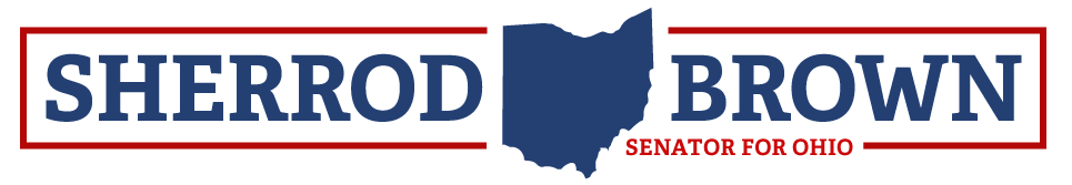
But even then, he was experimenting with secondary logos that featured the "Dignity of Work" slogan and a small version of the canary. These early versions (scroll down in the NYT story and you'll see it at the bottom) featured the canary in a cage. The cage is (thankfully) gone now and the canary has been enlarged and moved to become the focal point of the design.
The canary is not my favorite thing in the world. It's weak. It's lifeless. It guarantees that Trump will nickname Brown "Tweety Bird." Let me amend that: I hate the canary.
But at least it's an idea. And if you have a visual idea that means something to the product—even if it's a bad visual idea—then you can use it to anchor a brand. And, as our friend Bierut concludes in the video above, ultimately, logo symbols serve as empty vessels to be assigned meaning.
Which is exactly what the Brown campaign is doing.

Look, it's not Lacoste. But as Peter Thiel likes to say, a bad plan is better than no plan at all. So put a bird on it.
The other new logo we have is Tulsi Gabbard's "Tulsi 2020" effort:
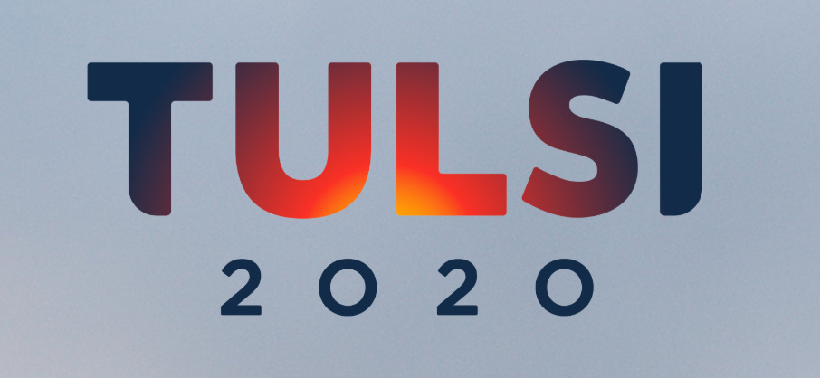
Visually, I like this a lot.
Gabbard's campaign is using off-brand colors, but they're warm, inviting, and modern. The font is a very simple sans serif, but the little touch here is the scalloping on the bottom of the "T" and the "I." This is subtly suggesting that the entire form is contained in an invisible circle, so that the text is anchored even without a visible border. The red gradient emanating from just off center increases that sense of the invisible circle and also gives you two feelings of motion: Both radial expansion from inner to outer and vertical motion as the sun rises.
The elements here are also highly reusable. You can put the "T" inside a circle and then use the warm red gradient behind it. You can use it across a wide array of background colors.
It's sleek, it's beautiful, it's everything that Brown's canary is not. But the one thing Brown has going for him is that his logo means something to him, personally. It may be ugly. It may not create positive, energizing feelings. But it connects the candidate to the brand in a way that people will both recognize and remember.
And that's not nothing.


