


The 2024 Campaign Logo Rankings
Graphic design is my passion.

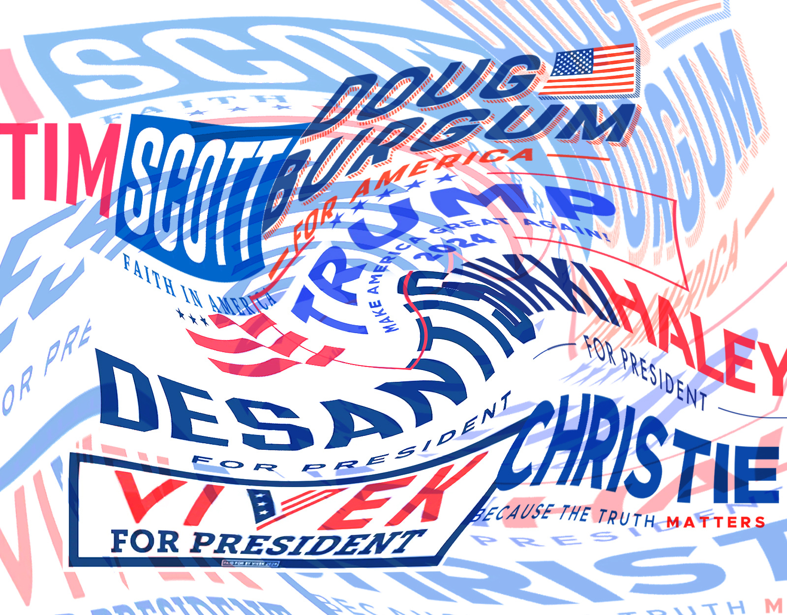
If I’d told you a year ago that we would have nine Republicans running for president in 2024 I bet you’d have thought that the field would feel . . . bigger?
As it is, it feels like we’ve got an anointed nominee, a potential spoiler, and a bunch of spare parts.
And yet, the beauty of graphic design rankings is that even a no-shot nobody can win it all.
But before we start: Do me a solid and share this with a friend. Because everyone loves logo talk.
1. Doug Burgum
Look: You’ve never heard of this guy and that’s okay. If you Google “Doug Burgum” his campaign website is the sixth result, coming immediately after the “People Also Ask” section.
But hark!
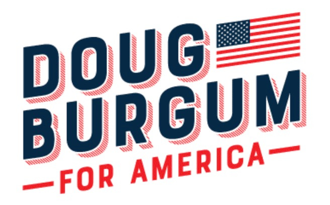
Shadowboxing. It’s the simplest 3D effect and yet it makes the logo jump off the page. On a gray t-shirt it’s even better:
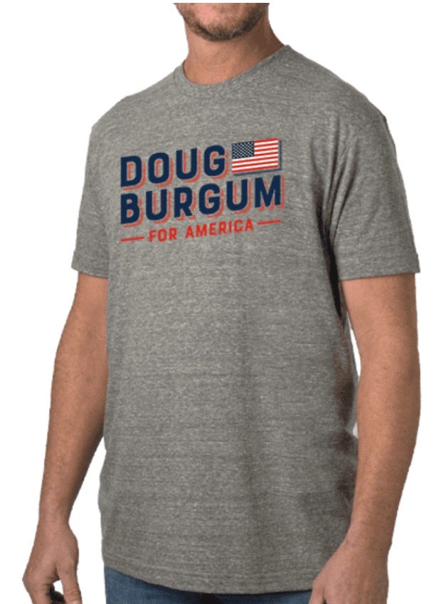
Strong navy blue. Nice shaded red for the shadow. A jaunty tilt up and to the right—which everyone knows is where the future lives. A real Old Glory. And those short red rules framing “For America” to anchor the entire concept.

No kayfabe: I’m going to buy one of these shirts just to wear around. That’s how great the design is.
2. Trump
I’m sorry but this logo is still good.

Tremendously strong. Many people are saying it’s the best logo ever designed. Grown men—the toughest men—come up to me crying, with tears in their eyes, saying, “President Trump’s logo saved my marriage.”
The other candidates are saying very nasty things about Trump’s logo, but that’s because they’re jealous RINOs. Sad!
Seriously though? The concept is still good, but it’s gotten flabby. Trump’s biggest asset from a design perspective is his name—it’s short, has letters that are visually interesting, and has a meaning beyond the name that’s subliminally powerful.
He kept the design he used for 2016 and 2020, but tweaked it. Take a look at the evolution:
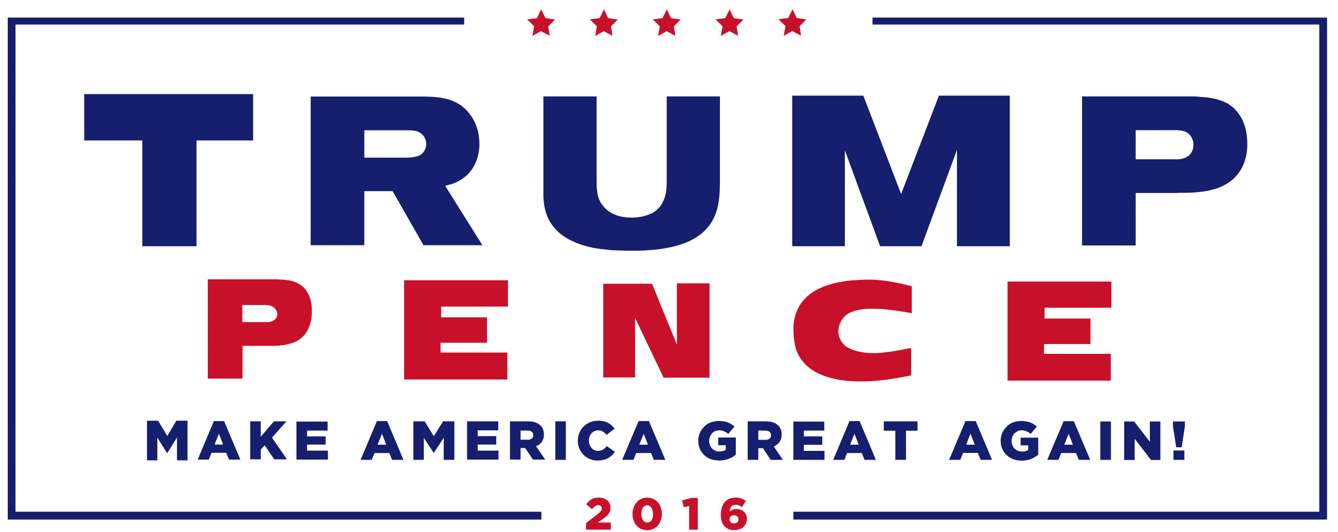
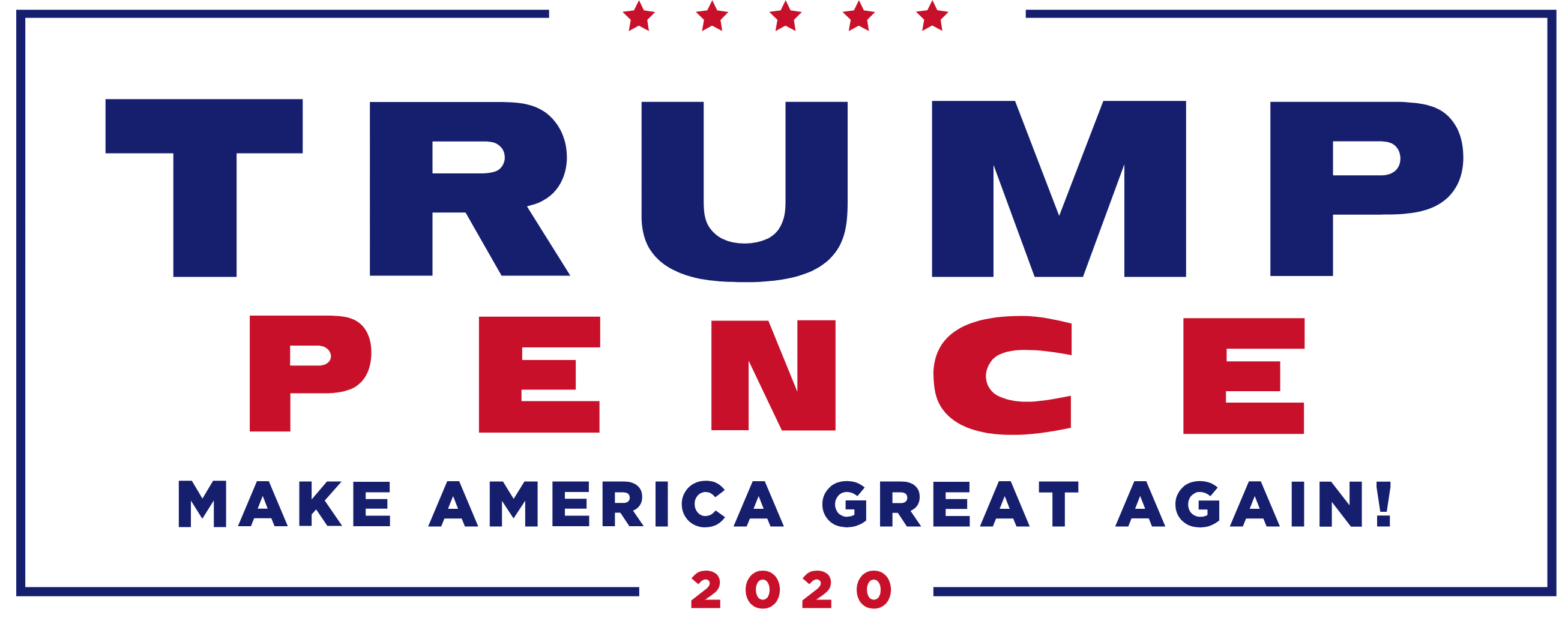
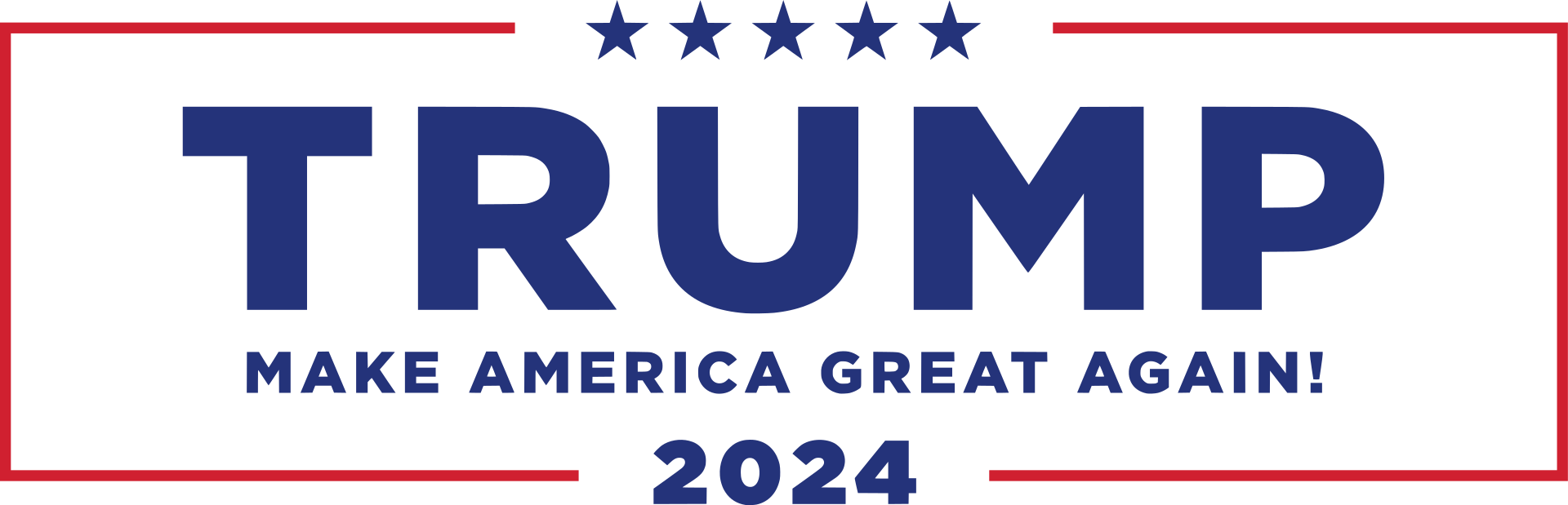
Some slight differences from 2016 to 2024: The TRUMP font has changed—it’s taller and less blocky. (You can see this most clearly in the trough of the “U.”) The kerning between the letters has been reduced, which stops “TRUMP” from feeling like it’s expanding outward. The blue is less navy and more royal. The year has been beefed up and bolded; ditto for the stars. And he’s swapped the reds and blues in the lines forming the frame and the stars.
All in all: It’s a strong design that looks like it’s been tinkered with by a consultant trying to justify an invoice, resulting in a small step backward.
3. Mike Pence
I have . . . so many questions.

Did Karen Pence design this herself? Does the former vice president have fond memories of PB&Js? Hannah Yoest nuked the fridge on this already.

In a way, I admire Pence’s logo. He is the Wonder Bread candidate—so many virtues added for enrichment. And Wonder Bread comes from Indiana! (Seriously.) If you’re gonna be a throwback to the Reagan era as a candidate, why not signal it with your design? Because this feels like a call back specifically to America circa 1984:
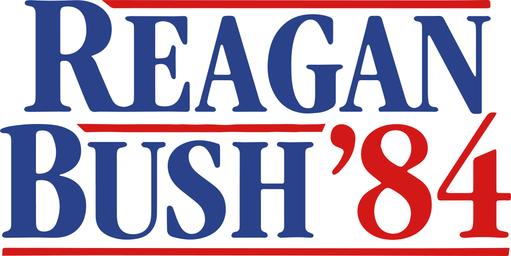
Look again:

Similar color palette. Similar font. Similar overall mouth-feel.
Here’s the thing: I like the Sentence-Case choice. I like the whimsical design on the leg of the “k.” I like the ridiculous kerning that has every letter touching except for those glaring, gap-toothed spaces on either side of the “n.”
At this point, why not just go all the way and add the primary color circles? If Pence had done this, it would have been instantly iconic. Here’s the logo America needed:
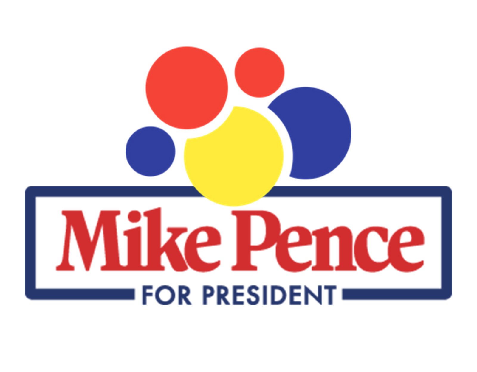
There’s still time, Mr. Vice President. Let’s just do it and be legends.
While I have you: Normally this newsletter is only for members of Bulwark+. We’ve opened it up for everyone today. If you’re new here, consider hopping onto our free list, where you can get lots of Bulwark #content every day, for free. Just hit the button below and then choose the “Free” option.
If you’re a regular reader, but haven’t made the jump to Plus yet, maybe this is the day to do it? We’d love to have you.
Because if you want stuff like this to exist in the world, you have to support it.
4. Vivek
I don’t love it. But I respect it.
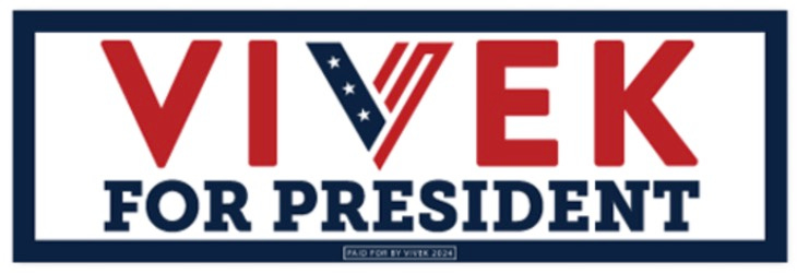
Everything here except for the stylized “V” is garbage, starting with the weak, curvy serifed “For President.” The colors are boring when they should be futuristic, to match the font of the candidate’s name.
But that “V,” man. It’s good.
Vivek’s “V” is bold and recognizable. You can drop it anywhere—on a ball cap, on a mug, on a square sticker—and it’ll say “Vivek Ramaswamy’s 2024 Presidential Campaign.” This mark conveys a ton of information about a totally unknown figure using one character, two colors, and very little space. Well done.
5. Christie
At least the big guy is trying something interesting: His logo isn’t about the logo. It’s about the slogan.
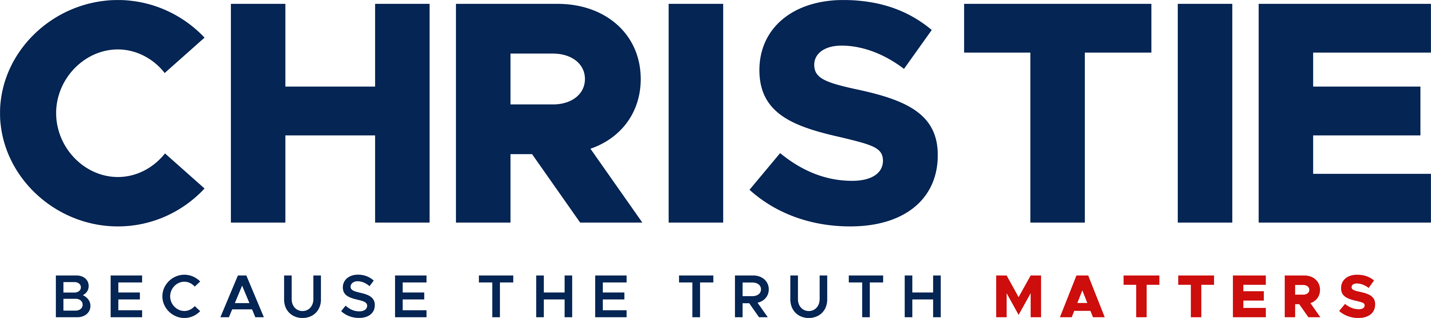
Christie’s name is beside the point. It’s done inoffensively, in a generic, modern sans serif. What the logo is really trying to hammer to you is Christie’s value proposition: He’s the guy who will tell you the truth because the truth matters.
Will this be enough to get him to 1.1 percent in the polls so that he can qualify for debates?
I mean, I would not bet the milk money on it. But good on him for trying.
My only note is that it’s a strange choice to put “matters” in red instead of “truth.” I understand the design appeal of having the final word in the tag line be distinctive. But the message here takes precedence over the design and I’m not sure “matters” is the word that needs emphasis.
6. DeSantis
On the one hand, it’s nice that DeSantis has stopped infringing on Trump’s mark the way he did back in 2021 when this was his campaign logo:
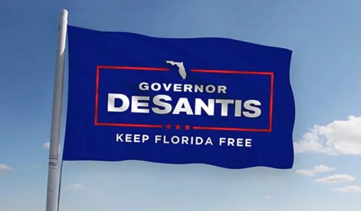
I can only assume that Trump sent a Cease-and-DeSist letter.
But left to come up with his own logo, Ol’ Puddin’ Fingers couldn’t quite get it done.
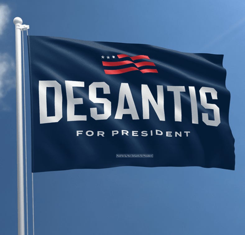
Doesn’t have the same punk-rock energy, does it? I’m pretty confident we won’t be seeing a ton of these in boat parades.
So what is DeSantis doing? He’s put his name in a college block font and bowed it out, to try to give it some movement.
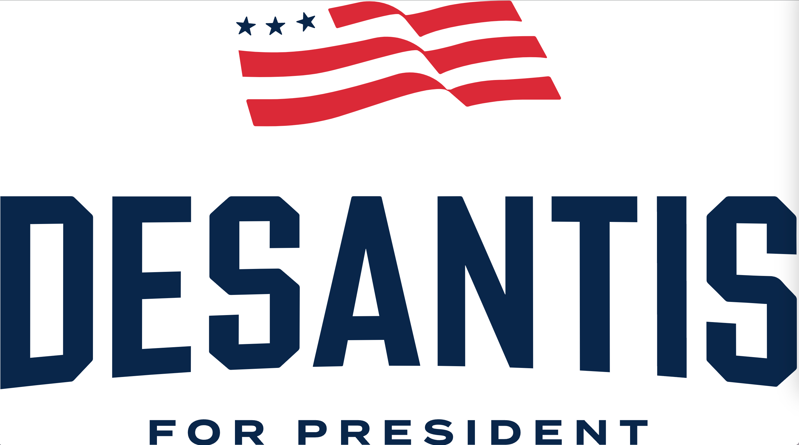
Then someone vomited a lousy abstracted flag—three stars and three stripes?—on top, so far above the name that the element feels like it’s floating away. Or like the designer forgot to delete it from an earlier draft.
That “flag” is both visually uninteresting and totally untethered either to the logo or the brand.
Unless it’s an Easter Egg meant to assure Conservatism Inc. that DeSantis knows what YAF is?
I’m not saying that graphic design is going to win or lose the presidency. But if the guy who won the last two nominations leads you by +33 points and has a cult of personality that even your own pollsters believe gives him a floor of 35 percent, this weak-sauce isn’t going to help.
You ought to at least look like you came to play.
7/8. Tim Scott and Nikki Haley
I’m grouping these two together, for reasons that will be clear in a minute.
First: If I had Larry Ellison Yacht Racing money and could bring in the best graphic designers in the world and they gave me this, I’d straight up murder someone.
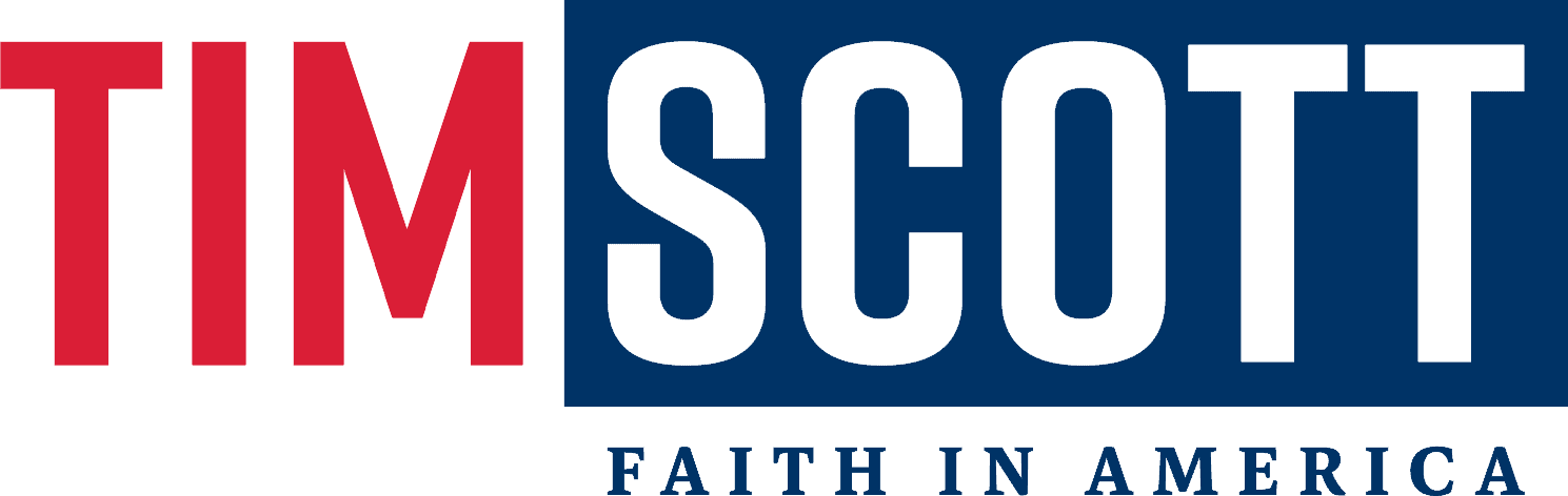
Are your eyes bleeding? Because my eyes are bleeding.
Why is the candidate’s first name competing with his last name? Why would you emphasize the weird visual of a double-T by making it ALL CAPS and putting it in a rectangle? Why does the middle v on the “M” not go all the way to the lower bound of the text line?
(And what the fork does “Faith in America” have to do with why this man is running for president?)
But the cardinal sin here has to do with eye tracking.
We’re trained to move our eyes from left to right. So we start with “Tim” and then our eyes move to “Scott.” But bright colors attract and hold the eye. So after we’ve registered “Tim,” and our eyes are trying to track to the right, they keep getting pulled back to the left by the bright red. And then the big blue box around “Scott” engages our eyes and sets up a tug-of-war against the “Tim.”
Your eyes are literally being pulled right, then left, then right again as they try to track the design and this tug-of-war is what makes you feel agitation while looking at the mark.
Absolutely one of the worst designs I’ve ever seen at the presidential level and I’d slot it dead last if I wasn’t tying it to #TeamNikki.
As for Haley, I find it hysterical that everyone talks about her and Scott in the same breath because they’re South Carolinians who are really running for VP. And then her logo echoes his:

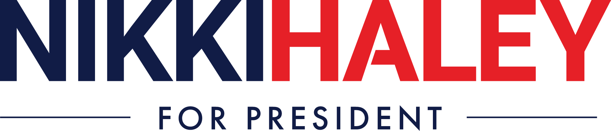
Amazing.
But at least Haley’s is competently done.
Her first and last names aren’t in competition. By putting “Nikki” in blue and then “Haley” in red, your eye flows naturally from left to right and then settles in one spot.
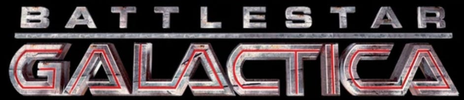
And you know what? I don’t even mind the vaguely BSG thing she has going on with her font.
9. Asa!
Dear God, what has he done?
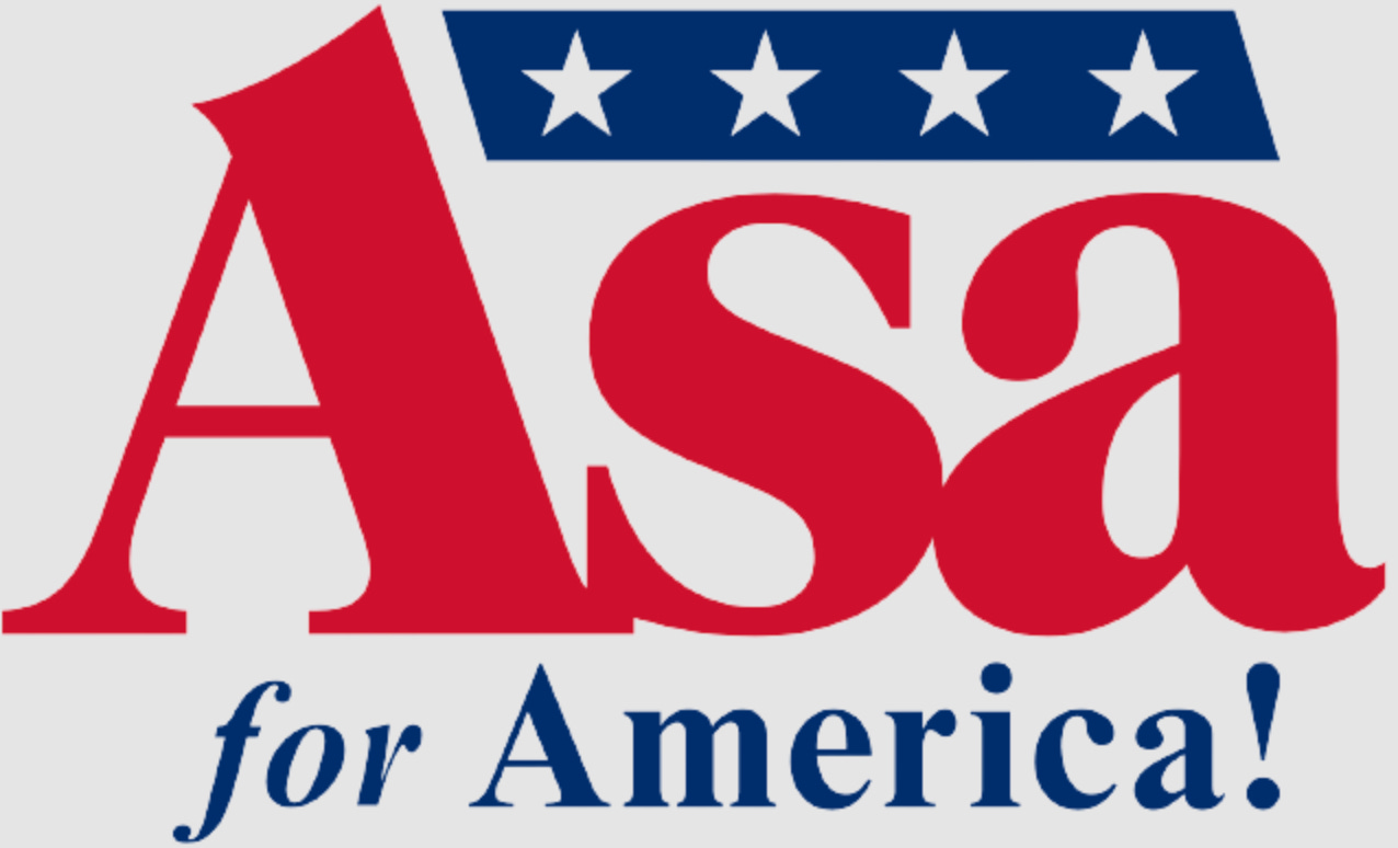
Love Asa. The guy is running a principled conservative campaign where he calmly tells the truth and I’d vote for him tomorrow if given the chance.
But this logo is an infamia.
He takes a complicated font (like Jeb!). Goes CAP, lower, lower with his three-letter name (like Jeb!). Uses boring Republican Red (like Jeb!). And then there’s the exclamation point.
The two things I hate most:
(1) Look a the space on the lower line where Asa’s name sits. Now look at that gap where the “A” connects with the “s.”
LOOK AT IT.
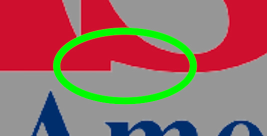
This isn’t just wrong, but look at the slope it creates. Down and to the right.
Which reinforces lots of down-and-to-the-right motion all over this thing.
As we established with Burgum, motion that goes up and to the right means progress.
Motion that goes down and to the right means decline.
I’m sorry, but that’s just science. It’s literally how we’re all trained to read graphs and charts starting in third-grade. And all of that motion is why this logo leaves you feeling kind of sad.
I mean, that and the fact that the most normal, honorable, traditional conservative is polling 0.5 percent. That’s not great, either.
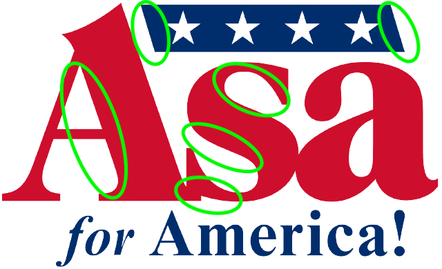
I could keep going: Why is “for” italicized? Why four stars instead of three or five? NOTHING HERE MAKES ANY SENSE!
Asa is running the campaign America deserves. He deserves a better logo.
Bonus: Larry Elder is running for president, too? I guess? I don’t want to grade him as a real logo because he’s not a real candidate. But for the completists out there:
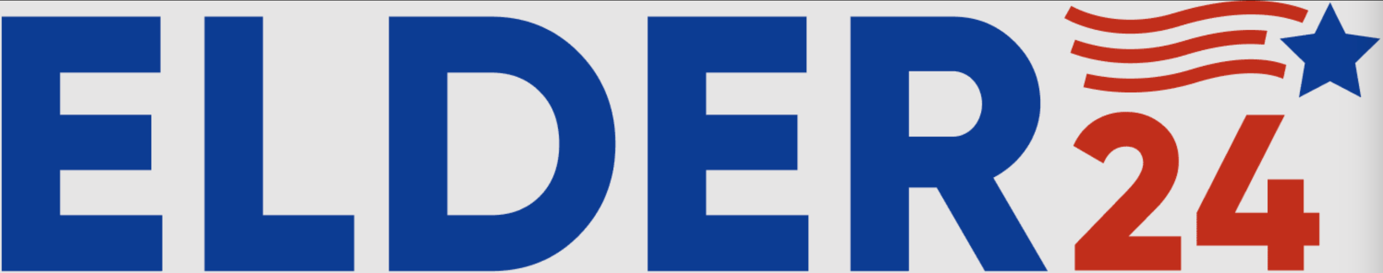
Bad. Very, very bad.
First off: If you’re an unknown gadfly, then you can’t just give your last name and no other information. What is “Elder 24” supposed to mean to people who have never heard of Larry Elder—which is 99 percent of Republican primary voters?
But what I really object to is the flag/star.
If this element is supposed to be a heavily abstracted flag, then it’s being done military-style. (Where flags are always supposed to be arrayed as if they’re waving in the wind while moving forward into battle.) But Elder has no ties to the military.
So maybe it’s a star and the red curves behind suggest that it’s bouncing across the screen? Kind of like a Super Mario power-up? Or that old Saturday morning PSA?

Whatever the case, this is hot garbage and Elder ought to be ashamed of himself. A middle-school art student could have done better.
Okay—those are the rankings. If anyone else gets in, we’ll do an update. Please discuss/analyze/fight-to-the-death in the comments.


I am very disappointed that none of you laughed at "Cease and DeSist."
Hannah Yoest for the win! That's fantastic branding. I'm imagining Pence could heave real loaves into the crowd at one of his events. It would add a biblical touch and, as his crowds tend to be rather small, it wouldn't cost too much. It might even attract additional hungry voters who happened to be passing by.